



Responsive Website Design
for Mobile, SEO, and Growth
Create websites that feel smooth, readable, and user-friendly on desktop, tablet, and mobile screens.
Codetech Media designs responsive websites that adapt naturally across devices without losing structure, usability, or brand quality. We focus on layouts, spacing, navigation, and content flow so your website delivers a consistent experience wherever users visit from.
- • 500+ Websites Built
- • 200+ Happy Clients
- • 98% Client Retention
Get Your Free Website Quote

Mobile-Friendly & Responsive Website Design Services
Users now switch constantly between desktop, mobile, and tablet devices. If your website feels broken, crowded, or difficult to navigate on any one of them, you risk losing attention and trust.
Responsive website design ensures that your layout, images, text, and interface elements adapt intelligently to different screen sizes. That makes the experience easier to use and often improves engagement, conversions, and search visibility.
At Codetech Media, we treat responsiveness as a core design principle, not a final adjustment. We plan screens and user flow with device behavior in mind from the start.
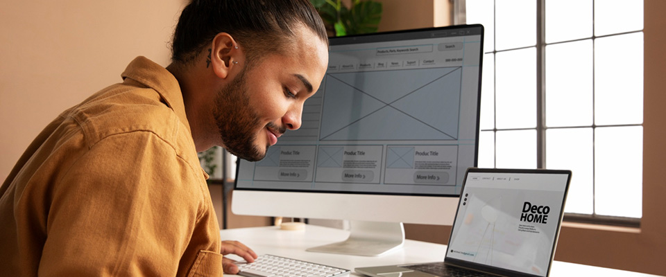
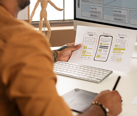
Our Responsive
Design Process
We design responsive websites by balancing layout flexibility, visual clarity, and usability on every screen size.
Device Behavior Review
We study how your audience is likely to access the website and how content should adapt across screens.
Layout Planning
We create flexible layout structures that maintain hierarchy and readability as screen size changes.
Navigation Simplification
We design menu systems and content grouping that stay easy to use on both small and large devices.
Content Prioritization
We make sure important messaging and calls to action remain visible and effective at every breakpoint.
Cross-Device Testing
We test responsiveness carefully to catch layout issues, spacing problems, and usability gaps early.
Refinement & Handoff
We fine-tune the design system so development can implement a consistent responsive experience.
Keep Your Website Strong on Every Screen
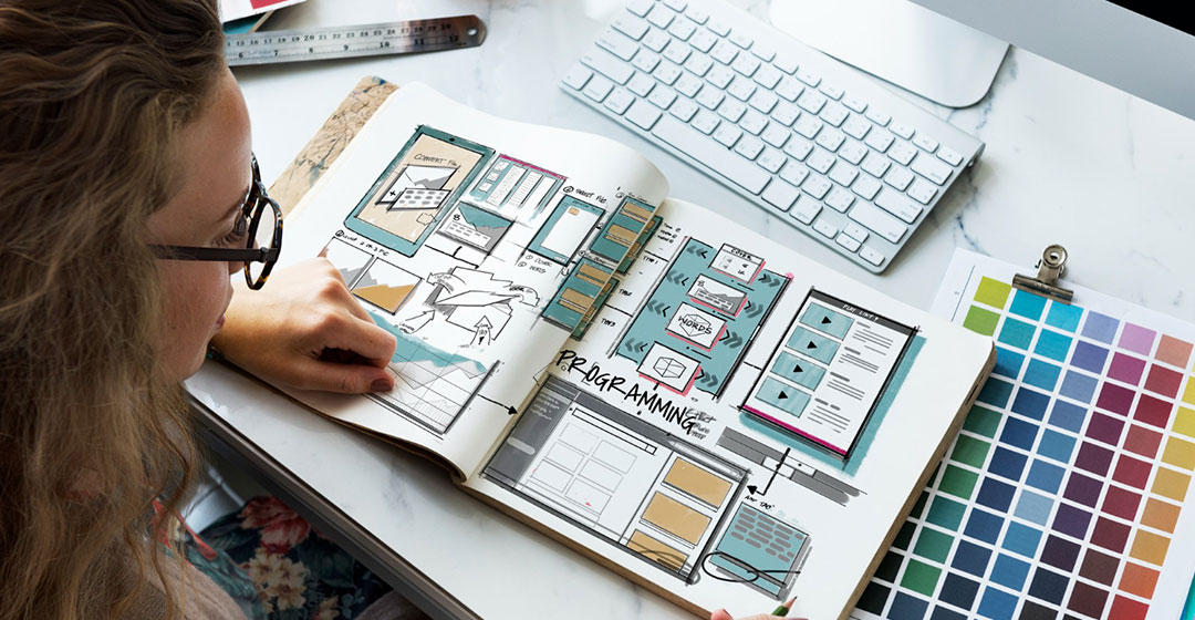

A responsive website helps your business communicate clearly no matter where visitors come from. It protects the user experience, keeps your content accessible, and helps create a more professional first impression.
We pay attention to typography, image scaling, spacing, interactive elements, and content order so pages stay easy to understand on smaller screens without losing impact.
That gives your business a more reliable digital presence and a better foundation for lead generation, engagement, and usability.
HAVE YOU PROJECT IN MIND?
Let's make something great together!

Why Responsive Design Improves User Experience
Responsive design helps your website stay readable, usable, and visually consistent across desktop, tablet, and mobile screens.
We plan layouts, spacing, navigation, and content flow so users can browse comfortably without zooming, confusion, or broken sections.
This gives your business a more professional presence and helps visitors engage with your content from any device.
What Our Responsive Design Service Includes
Adaptive Page Layouts
Flexible sections designed to reorganize naturally across device widths.
Mobile-First Thinking
Layout decisions guided by how real users browse on phones and tablets.
Responsive Menu Design
Navigation systems that stay simple and usable on compact screens.
Readable Content Flow
Text and content blocks structured for better readability across screen sizes.
Touch-Friendly Interactions
Buttons, forms, and interactive areas designed for smoother mobile use.
Testing & Refinement
Cross-device design review to catch alignment, spacing, and usability issues.

Frequently Asked Questions
Responsive design means a website adjusts its layout and content presentation to fit different screen sizes smoothly.
It improves usability, protects brand quality, and helps visitors interact with your website more comfortably across devices.
Yes. We can redesign outdated websites to perform better and look cleaner across devices.
Yes. Better mobile usability and structure can support search performance and user engagement.
Yes. Cross-device testing is a key part of our responsive design process.
Work with us
Need a website that works better on every device?
Tell us about your current website and user challenges. We’ll help you create a responsive design that feels smoother and more professional across all screens.